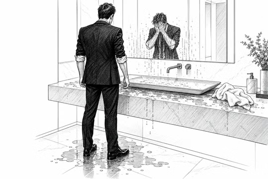
Architecture, software, video, data formats. Often, you make choices when creating an artifact. We call them design choices. Design choices should always follow function. They aren’t there to be beautiful or perfectly organized on their own; they have to serve a purpose. Sometimes this concept gets lost, so I would like to provide a few examples to clarify my point of view.
On websites, I often see aesthetics prioritized over functionality. For me, this is one of those things where the answer is no; it shouldn’t be done. Functionality comes first, then aesthetics. If I visit a modern art gallery, that is the only place where aesthetics takes precedence over functionality. When I go to the restroom in a modern art gallery, or when I leave the gallery, the situation is reversed. This is how the world should work. Because making functionality a second priority doesn’t serve anyone; it merely satisfies the ego of the architect who designed it. I can say it with a smile, but the fact is: everyone has an ego to feed.
For example, I have been in I don’t know how many hotels (I’ve lost count), and they are often new properties with a modern design. Now, I like good design, but what possessed you to make a bathroom like that? You actually have to wash your hands and face in there. If, after I wash my face, it looks like an entire soccer team has just showered there, something isn’t working. If a space is beautiful but unusable, you put function as the second thing, and maybe you lost sight of the point, which is that you don’t have to make something that pleases the eye, but something practical to use and then, only then, visually appealing. I appreciate beautiful things. But when I walk into a hotel and see something clearly designed by someone who never used it and never will, I get angry because it wastes money and shows disrespect for the guests.
In high fashion, we accept designs that break with functionality. Take a wedding dress: You would never wear something like that in everyday life, right? Yet, you do wear it for that one special occasion. But you cannot take a garment designed for daily use and make it uncomfortable: that would be absurd. There isn’t much else to say.
Many sites are made in a way that I detest.
Modern sites are designed so that if you open them on a 30-inch screen, you see something massive and there is no way to use them properly. Or else I have to scroll forever to find what I want, with nothing at the top to show me where to go.
If this makes sense on the phone, it makes zero sense on a big screen. I understand there are small vertical screens, but no rule says we must assume people use only their phones. Or, better yet, you can make sites that work one way on the phone and another way on the desktop. Yes, it takes more time; yes, it requires more effort. Thank you. It can be done; I am not saying things from Mars.
There are many, many ways to design a website. When I had to make my own choices, I didn’t necessarily fall in love with a specific design. I liked it because it was functional, not because it was outstanding. Now, being functional sometimes also means removing unnecessary things. So removing what isn’t necessary doesn’t mean removing content. And when I see websites with such a minimalist design, they remove content to keep the two or three sentences they want to highlight, resulting in elements that appear disproportionately large on desktop monitors. Yet, relegating an element to a menu makes it less visible and requires an extra click to access, assuming the user can even find it.
When I say design shouldn’t take precedence over functionality, I mean that a website’s visual style shouldn’t compromise accessibility to make the landing page look aesthetically pleasing. And I always look for a balance between these two aspects. I am not saying that we have to create a very, very dense website, full of content from every angle. At the same time, we can’t keep the page all white or all black to highlight one word and keep the home page or landing page clean. It isn’t a good idea. It could please people who want something nice to see, but is it truly effective? I don’t know. We have to make choices.
Another example of bad design is to provide too many options.
If you give a user 400 options so they can do anything, you basically shift the responsibility of choosing onto them. If the request doesn’t specify exactly what is expected, don’t resolve that uncertainty by giving the user 40 parameters to choose from. The idea is that 38 of these 40 are obvious choices you could make as a designer. It makes the product simpler, and it makes the designer, or better, the product manager, in charge of what is important and what is not.
Another example involves an internal tool we built, for which we had to design a scheduling format. We started with the basics, such as an event’s start and end times. Imagine setting an alarm on your bedside phone: you set it, then start thinking, “Okay, but it’s a recurring alarm.” So, you want to be able to define the hour, minutes, time of day (AM/PM), day of the week, and repetition frequency: all parameters worth including. For instance, if we want to promote Easter eggs, we might launch the campaign 20 days before Easter and end it a week later. So the reference now is Easter, not a specific date. And Easter changes every year. But at a certain point, you realize we are covering edge cases we might never encounter in our business, because we don’t sell Easter eggs.
If we are building something for our own company, maybe we should provide only what we actually need in most scenarios. For us, a start date and an end date are more than enough, indeed. So why add superfluous features? That will make usability more complex. Moreover, we’re now talking about the file format we use to define this information. It’s not a question of user interface. It’s a question of whether we are creating technical debt for the future. Because now we have to maintain compatibility with a more complex format even if no one actually uses it.
Every choice has side effects, including quality.
Many of the choices we make for our video courses don’t aim for absolute quality, but for the best possible compromise: two very different things. Take editing, for example: we keep it to the bare minimum because doing otherwise would take too much time. What added value would changing the camera angle bring? Sure, we could do it; anything is possible. But the question is whether it is truly necessary. Our time on this earth is limited, so at some point, we have to make choices. If we decide to spend more time changing the shot, we will have less time for other things. Others produce videos of undeniably higher quality than ours; I am not here to claim our videos are better. We have made considered choices about how we manage the time we dedicate to producing our video content.
For example, I have a room with natural light, and I did not bother to darken it. Alberto works in artificial light. This means the lighting changes during my parts of the video courses. I don’t care, in the sense that it is not that important. You see the light changes between modules, but you cannot say which one you prefer, and from an educational point of view, it doesn’t matter at all. Why? Because this way I have everything in my office, and the natural light helps me stay calmer. Everybody has their own paranoias! I have this one, and other people have others.
But if you want to make videos and ask me what to choose,
audio is 100,000 times more important than video.
It isn’t even a question of orders of magnitude. You could produce a bad video: if your face isn’t visible, the audio is perfect, and the screen is clearly displayed (and it’s hard to mess up a screen capture), it’s still fine.
You can even leave out the video entirely if you want. The video is totally secondary. Then, of course, you want to put the video, but how far do you go? The video surely comes out better, but does it serve anything? We aren’t models, after all. And past a certain point, you tell yourself, “Wait, the flaws are starting to show here; no, the resolution is too high.”
I am not saying that aesthetics aren’t important. They are. We always want the design to be beautiful. Who would want to see something ugly? No one. However, aesthetics must be secondary; they must serve a purpose: functionality. Ultimately, I don’t want a beautiful object that I don’t use. I want an object I use that is also beautiful.
Function first.